


As we saw in our article on landing pages, landing pages are a crucial part of any digital marketing strategy. They have a single purpose: to offer an offer to the visitor and convince him to accept it. Does this seem like an easy task? Even the most experienced marketers can make mistakes that negatively affect their effectiveness.
We hope you’ll take advantage of our list of the 7 mistakes to avoid and how to correct them in order to get the perfect landing page. Let’s get to it!
1. Broken Links and Slow Load Time
Link access and load time are definitive aspects of a page. If they have errors they are the easiest way to lose potential customers. They can be a reason to have a low ranking in Google, making it difficult for potential customers to find you online.
So, how to avoid a slow landing page or broken links?
- Adjust the size of images and compress them.
- Analyze their speed. For this you can use Google’s PageSpeed Tools.
- Check if there are technical failures on your website. You could use Google Search Console and Screaming Frog SEO.
2. Lack or Excess of Information
Both too little and too much information can cause users to abandon before interacting. It is crucial to keep the page simple and focused on the desired action.
To achieve a balance of information:
- Provide complete and relevant information: pricing, key features and benefits.
- Highlight crucial information: use bold, bold colors or bullets.
- Take care of the wording to make it concise and understandable.
- Eliminate distracting elements such as animated banners, pop ups, etc.
- Limit links and actions so as not to confuse users.

3. Unattractive Design
All the details that make up your landing page are part of the design. Opt for simple elements that work in harmony with each other. Always remember the phrase “less is more”.
Do you want to know how to achieve an attractive design?
- Avoid overloading the page with images, graphics, text or flashy colors.
- Avoid excessive variety of colors, fonts and elements to reduce the bounce rate.
- Use white space to provide clarity and visual rest for the user.
4. Lack of Clarity in the Call to Action:
Your users should know immediately what action to take when they enter your landing page. The call to action (CTA) must be clear. If users have to figure out where to click, you’ve missed opportunities.
To correct this mistake, we suggest you:
- Avoid multiple CTAs
- Use attractive colors and large, easy-to-see buttons.
- Do not use too much text in the buttons and opt for the same font.
- The call should be provocative, concise and persuasive; but also friendly and trustworthy. “Subscribe now,” “Buy here,” or “Download your free guide.”
5. Poor Form
A poorly crafted form compromises 100% of your result for one simple reason: it is responsible for generating the conversion. Keep in mind that you should only ask for what your subscriber needs.
To create an effective form we suggest you:
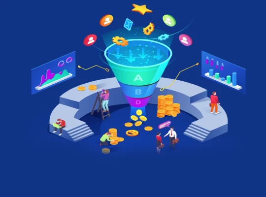
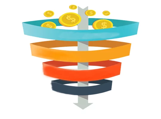
- Focus on the data you really need. Three or four sections is the most you can ask for at the top of the funnel.
- Structure it in a visible way, contrasting it with the background of the page.
- Use a clear and eye-catching title, which serves as a call to action. For example: “fill in the form”.
- Make sure it is compatible with mobile devices.
- Prefer a vertical format, which is easier for users to follow.
- Label each field and provide examples to guide the user.
- After submitting the form, clearly show any errors and provide a visual way to correct them.

6. Lack of Testing and Optimization:
Don’t make the mistake of creating a landing page and forgetting about it. There is no magic formula to make it work the first time, but to get it right, you need to perform several tests and optimize it.
To correct these mistakes, we suggest you:
- Perform text tests to correct typos and spelling errors before publishing the page.
- Implement A/B tests on all the resources of your landing page to improve conversions. For this we suggest using Google Website Optimizer.
- Redesign based on metrics, A/B testing and user feedback.
- Use tools like Google Analytics Event Tracking and Google Virtual Pageviews to analyze traffic and user behavior on your landing page.
- Make sure your page design is responsive to adapt to mobile and tablet devices, as Google penalizes websites that are not mobile-friendly.
7. Lack of Social Media Channels
It is already a reality: social networks are crucial in the digital strategy. Even if visitors are not interested in the offer, they may want to share it with their contacts. This helps to increase traffic, reach new customers and strengthen relationships with current ones. To correct this mistake, we suggest you include sharing buttons on social networks.
If you have come this far, it means that this topic is of interest to you. Dive into the knowledge about landing pages. If you’re looking to dig deeper, our article “7 Ideas to Increase Traffic on my Landing Page” offers important things you need to know.
Conclusion
In conclusion, to create an effective landing page, it is best to create a simple, relevant and easy to navigate page.
As a checklist, remember to avoid these mistakes:
- Broken links and slow loading time
- Lack or excess of information
- Unattractive design
- Lack of clarity in the call to action
- Poor form
- Lack of testing and optimization
- Lack of social media channels
Do you have any other error in mind that we haven’t listed? Leave it in the comments field.
And now that you know, don’t be the one who makes these mistakes!
If you want to optimize your Landing Page, contact us at DISSAU and we will guide you along the way!