Are you starting your business, do you have your website, do you offer services and products focused on the customer, but you do not achieve the reach of customers you want? That’s where landing pages come to play a key role.
If this topic is new to you or if you are looking for additional information, take a look at our article “What are landing pages and what are they for”.
Landing pages are a crucial part of any digital marketing strategy. It has a single purpose: to make an offer to the visitor and convince him to accept it. When it comes to creating a landing page, there are many aspects to consider.
It is important that the page is attractive, has relevant content and a clear call to action. However, there are also a number of mistakes to avoid to ensure that the page has the potential to convert visitors into customers.
Here we share with you the most common mistakes to keep in mind when creating your landing page. Follow us!
1. Inconsistent, Too Little or Too Much Information
A core issue, which is why it is at the top of our list, is the information provided. If it does not have the required quality, the failure rate is high.
A digital marketing campaign starts with a purpose, therefore, the message must be aligned to your landing page. You cannot make an ad on social networks or search engines, where you promote something different from what the user will find on your Landing Page. This will confuse your audience, your campaign will fail and you will lose the trust placed in your company.
The recommendation at this point is that you work in a complete way the whole process that the user will experience, from the moment he clicks on the ad until he fills out the form or decides to buy what you offer. You can also create different landing pages for each of your campaigns.

So, we have a landing page with coherent content, the offer is very interesting, but how much does it cost, how does it look, has this ever happened to you? A user who does not find the basic information that facilitates the decision making process will be a lost customer.
To avoid this mistake you can provide a clear and concise content of the main features, benefits and prices of your product or service. Accompany it with a photograph or a high quality illustration that reflects what you are proposing. If you want to build trust and empathy with your audience, respect them and treat them as they deserve with real visual content.
Oh, and don’t forget the Contact Details so they can get in touch with you.
On the other hand, as many elements to take into account in a landing page, it has to be simple. If your page is too complex, the user will be overwhelmed and will leave, perhaps never to return. Do not burden the visitor with too many messages, images, buttons, forms…
Make it easy! Do not clutter the page, leave blank spaces. Eliminate distracting elements such as animated banners, pop ups, etc. Limit links and actions so as not to confuse users.
2. Lack of Clarity in the Call to Action
The call-to-action (CTA) has to be clear, simple and direct, provoking the visitor to perform the action you want. If users have to figure out where to click, you’ve missed opportunities.
To solve this, it has to be placed in a prominent place, with prominent colors and next to the landing page button/form, so that the user knows how to perform the action you want. It must be concise and persuasive; but also friendly and trustworthy: “Subscribe now”, “Buy here” or “Download your free guide”.
We can place a second call to action, just below the whole thing, either for users we haven’t convinced, or for those who come to our thank you page. For example, ask them to share the content on social networks, to download a catalog with the features of the product we sell, etc.
3. The Design of your Landing Page does not Relate to your Brand’s Identity
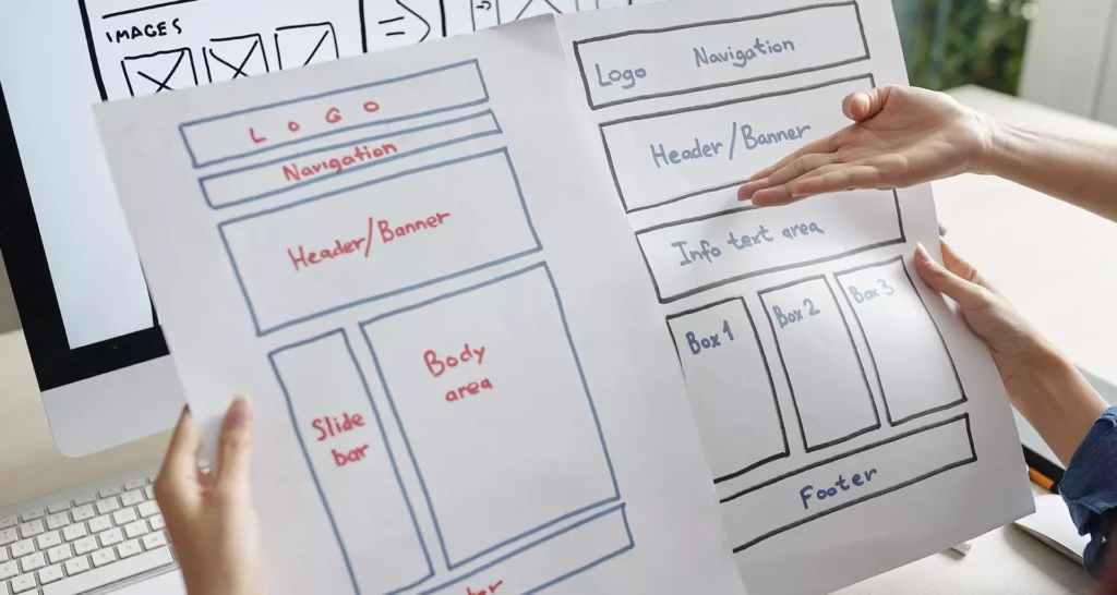
The message and design of your Landing Page must reflect your brand identity in order to generate trust among users. It is crucial to maintain consistency in content and style to avoid visitors perceiving inconsistencies, which could negatively affect the perception of your brand.
Make sure that the page design reinforces your Inbound Marketing strategy and that elements such as color palette, logo and typography are consistent with those used on your website.
It is recommended that your brand’s Creative Director or designer be the creator of the graphic part of your Landing Page.
4. Deficient Form
The form is responsible for conversions. If it has too many fields, nobody will want to fill them out and you will lose the opportunity. Be as simple as possible and ask only for the essential data. Three or four sections is the maximum you can ask for at the top of the funnel.
It should be prominent and visible at first glance, without having to scroll. If your landing page is very long, it is advisable to place another form at the end of it, so that users do not have to go all the way to the top to leave their data.
5. Not Performing Multivariate Testing and Optimizations
Don’t make the big mistake of creating a landing page and forgetting about it. Outdated landing pages can affect the positioning and traffic of the website, negatively impacting the business.
It is recommended to redesign them considering metrics, A/B testing and user feedback.
To maximize online visibility, it is suggested to optimize them for commercial keywords and adapt them to a responsive format due to the increase of searches from mobile devices. Keeping all landing pages optimized and updated is fundamental for Google’s favoritism and better positioning; as well as taking concrete actions to increase traffic to your landing page.
Find out more about web traffic, essential to achieve views and higher rankings and conversions. Don’t miss our article “7 Ideas to Increase Traffic on my Landing Page”.
Conclusion
As we have already seen, the success of your Landing Page will depend on taking these elements into account; all of them are essential to reach the leads and turn them into satisfied customers with your product or service.
The important thing is that from now on you avoid these mistakes as much as possible in the creation of your Landing Page and work carefully on every detail of your campaign.
So plan your content and offer valuable content to your audience!
Do you want to boost your business? In DISSAU we are ready to collaborate with you.
Contact us now!


